OYSHO Training, the evolution of a Leisure Brand to Activewear
November 26, 2023
OYSHO, is a well-established Spanish brand that belongs to the Inditex, and has received recognition for many years for its wide array of loungewear, lingerie, and sleepwear. Up until three years ago, many people had mainly associated OYSHO with loungewear.
However, during the last couple of years, it has observed a significant change regarding the perception of the brand through research projects that SNGULAR has carried out for the popular retailer. Little by little, interviews have profoundly revealed how clients and consumers were talking more about Activewear from OYSHO, either from a comment made by a friend or family member, seeing something in the store, or attending one of the health and wellness events sponsored by the brand.
According to Jorge Vicente, who is in charge of Digital DesignOps for OYSHO, «In reality, the presence of athletic wear in OYSHO is very evident of the power of our clients and that we can affirm that the brand has consolidated its position by demonstrating its value in the athletic wear market. When a client is asked about the type of products offered by OYSHO, athletic wear is mentioned as one of the principal products from the brand today».
OYSHO Training: Why design a training app?
With the dawn of the pandemic, OYSHO decided to help its users stay active during a time when people weren’t able to leave their homes to go on a run or workout at a gym.
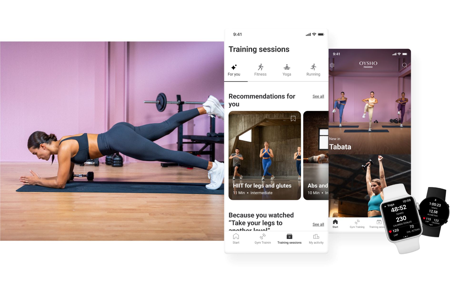
During this period, a collaboration was born between OYSHO and SNGULAR to create OYSHO Training, an innovative fitness application intended to facilitate the independent practice of yoga, running, and other types of workouts. The application is available for free on Apple and Android, and is equipped with high-quality content that is exclusively designed for the present and future needs of OYSHO users.
The OYSHO Training app goes above and beyond being simply a clothing store app. What the brand aims to achieve with this new digital product is this triple proposal:
Reinforcement of the brand as an activewear retailer: OYSHO Training hopes to improve the credibility of its brand’s image through the App by incorporating professional sports content.
Engagement with the brand: The application is a powerful channel to establish a connection with the client, integrating an experience with the activewear collection and content centered on different types of fitness.
Innovation of services for users: OYSHO Training allows the brand to get closer to its users in a more effective manner by helping them understand their needs, habits, and customs more profoundly. This enables the development of innovative content and the search for new opportunities through a continuous and constantly evolving design process.
According to Jorge Vincente «From the start, our goal was to ensure that OYSHO Training became a platform that was adapted to the needs of our users. We strived to make it easy to use, and intuitive, and for it to offer a personalized experience for each woman. In order to follow through with this goal, we worked closely with the SNGULAR design team. They provided us with support from the start of the project by contributing to the creation of a platform that not only met our expectations but also our customers.»
Scalability and Adaptability that is Focused on People
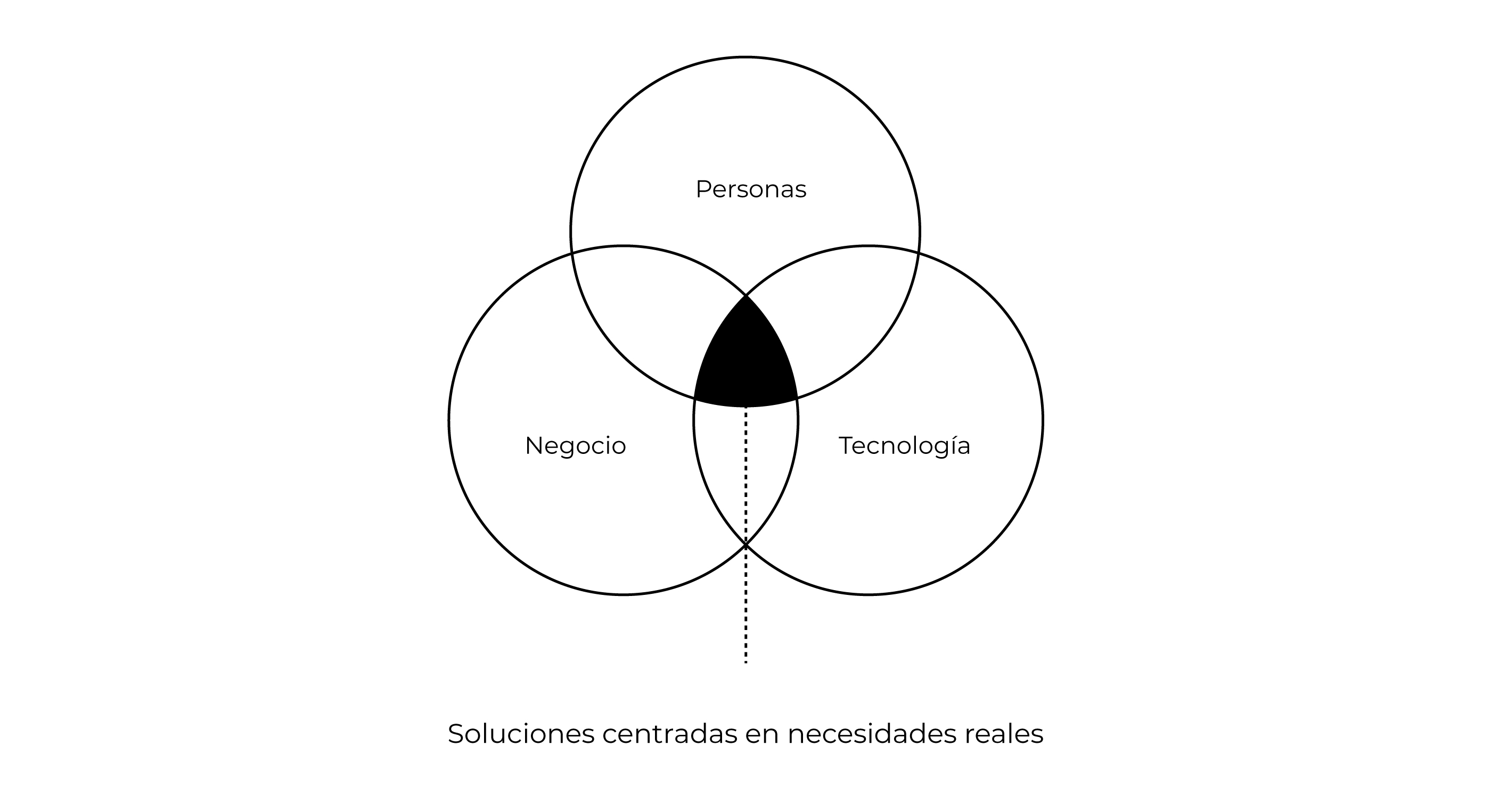
SNGULAR proposed to adopt a Human-Centered Design approach, a philosophy that puts people at the center of the design of digital products and services. This approach ensured that every decision made during the design process took into account user requires, obstacles, and potential biases.
HCD encourages the creation of solutions that are not only visually attractive, but also integrate harmoniously into people's lives, addressing real problems, and contributing to their well-being. Adopting this vision encouraged collaboration, constant iteration, and the ability to adapt as we deepened our understanding of users.

Another important point in design projects like OYSHO Training is the ability to anticipate and adapt to the changing dynamics of the user and the market.
Noelia Martín-Albo, Product Designer at SNGULAR, highlights the importance of approaching the design from the beginning with a perspective of scalability. “Starting the process with a fully scalable mentality allows us to not only satisfy the current needs of users, but also anticipate and adapt to future changes and evolutions in preferences and expectations,” she notes.
Scalability in the design allows for the ability to expand and modify the application fluidly and efficiently as circumstances evolve. In the context of OYSHO Training, starting with a modular approach has been essential for its design, since the application initially focused on exercises most in demand by users like cross-training, yoga, and running, but over time it has incorporated new types of training such as kickboxing or dance, which have been very well received by the audience.
This scalable design has allowed the application to evolve naturally, while simultaneously accompanying the changing needs of users and adapting to a broader spectrum of sports preferences.
OYSHO Training App Design Phases
From the defining of the first information architecture to the development and launch of the app, the digital product has been updated and renewed in a process of constant iteration and improvement, while aligning the insights of the Research team with the business strategy and technological possibilities.
Definition Phase
At this stage, the SNGULAR Research team immersed itself in the project, by focusing on studying users and exploring the market.
Javier Rodríguez, Senior Design Researcher at SNGULAR, shares his insights: «During the pandemic, OYSHO set out to help its clients maintain their fitness from their homes. In this effort, we expanded our research to users in environments where exercising at home is more common, such as in the United States or Germany, with the aim of adjusting the value proposition to the Spanish context.»
Women Archetypes
In-depth interviews were conducted to understand the habits of people using training apps. This allowed us to define patterns and archetypes based on their interests and their way of associating with working out at home.
Benchmarking:
After reviewing the signals from the research on the app's users, a study of similar applications was carried out at a national and international level. The objective was to identify typical functionalities that met OYSHO's objectives.
Value Proposition and Information Architecture:
Based on the findings of the Research team, the SNGULAR Design team took responsibility for the following creative exercises. At this stage, the definition, and prioritization of key functionalities were carried out, simplifying the communication of the development scope. This enabled an agile approach in the design phase, allowing more time to be spent on perfecting the prototype.

Interface Design Phase
Conceptualization, Determining Flows, and Prototyping:
In this phase, after defining and prioritizing the product's functionalities, the Design team began the conceptualization and creation of flows. Intuitive and logical paths were developed to guide users, making it easy to define the information architecture for clear navigation.
With these first designs, we developed the prototype of the application in Figma, which allowed us to test the concept with end users in the next stage.
Concept evaluation:
With the prototype in Figma, a series of tests were carried out with users and stakeholders to verify the usefulness, understandability, and ease of use of the interface. These tests offer valuable feedback on usability and the user experience. Iterations are made to optimize the design before passing it to the development teams.
At the end of the tests, there were videos showing the interaction with the prototype on a real device (Apple Watch). This made it easy to identify the findings and make modifications to improve the interface and the flow of the application, ensuring that the final version was refined and ready to be launched.
Interaction Design and UI Prototyping:
Using the test results and user feedback, the interface was adjusted, and the visual elements were defined. The objective was to build the first version validated by real users.
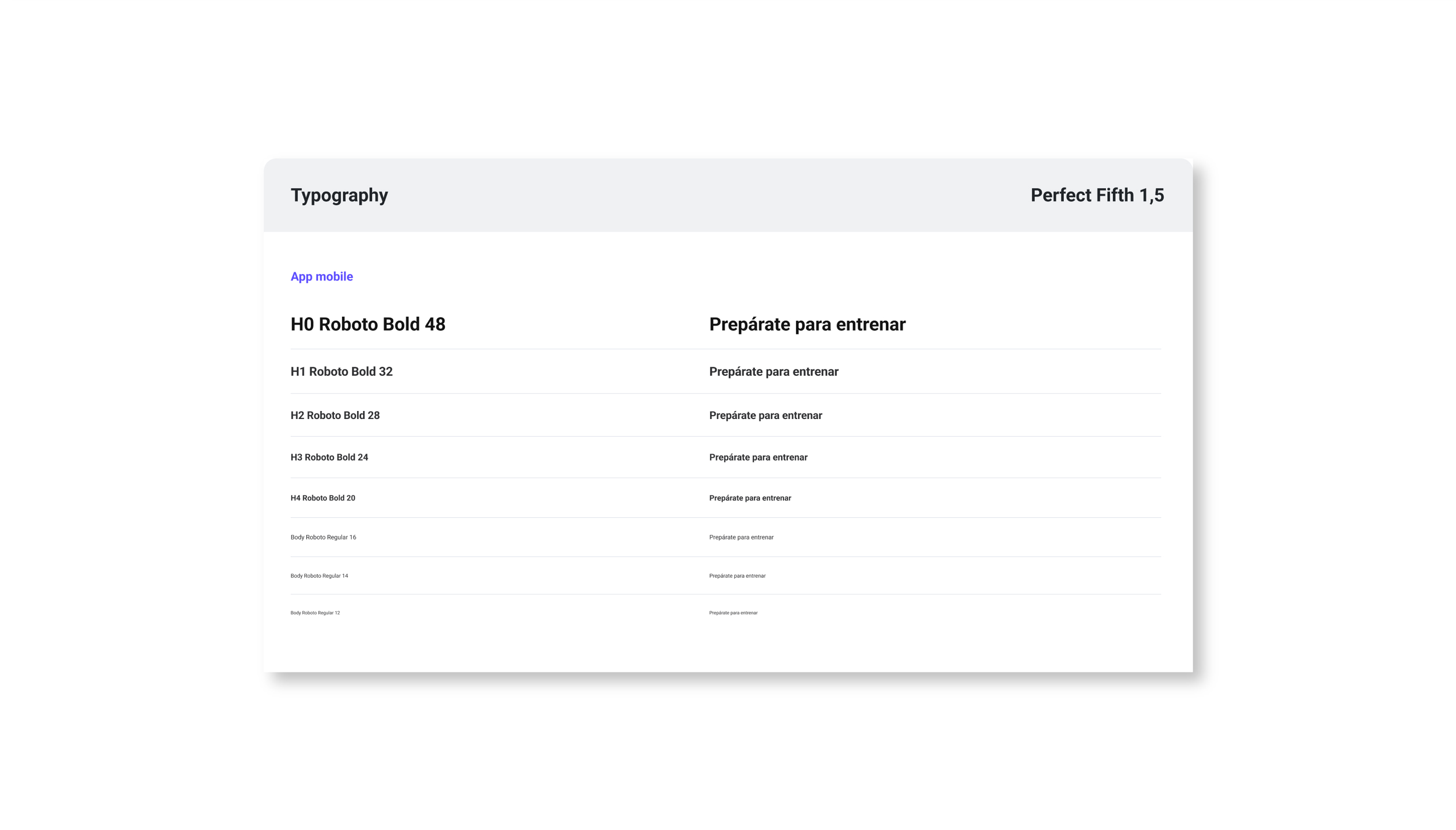
To establish the visual identity of OYSHO Training, the OYSHO Design System was followed, carefully selecting elements, and nuances and highlighting distinctive aspects in color, typography, and adapted web components. This ensured a consistent and engaging experience within the context of the OYSHO brand.
Development Phase
Documentation and Figma Hand-off for Development:
Once the design was completed, it was documented in detail in Figma, creating a structured information package that was subsequently delivered to the development teams. The hand-off involved an agile and organized transition from the design to the developers, which included providing detailed information on interactivity, animations, and other relevant technical details. Resources such as assets and style specifications to ensure an accurate implementation faithful to the original design were contents incorporated in the hand-off. During the content, development, and testing phases, the team played a crucial role in coordinating and following up with the teams involved.
Launch and Iteration Phase
The launch phase not only involved the official presentation of the application to the public, but also marked the beginning of a stage dedicated to validating the product and evaluating the experience of female users in real environments, such as their homes, gyms and the outdoors. This process was essential to obtain valuable insights that played a fundamental role in ensuring that the application fully met the expectations and needs of users.
According to Noelia Martín-Albo, «We used various methods, such as ethnographies, interviews, and diaries with the aim of collecting valuable information. This enabled us to continually iterate and consistently support our customers.»

Research became a fundamental pillar to ensure that the improvements and changes implemented were supported by solid evidence. This was achieved through various perspectives:
Business Vision: We worked closely with the team responsible for the commercial side of OYSHO to understand the vision and objectives of the business. This allowed the proposed improvements to be aligned with the company's strategic objectives.
Developmental Vision: Maintained active communication with the leaders and managers of the development team, ensuring that our proposals were viable from a technical perspective and could be implemented effectively.
User Vision: We greatly valued the user experience and that is why we carried out user tests. These tests provided valuable feedback on how they interacted with the app and what aspects could be improved for a better user experience.
Behavioral Analysis (Data Driven): We used concrete data to support our decisions. This involved analyzing user behavior in the application and drawing conclusions based on solid evidence.
Market Vision: Keeping a close eye on the competitive landscape through benchmarking and updated competitor analysis, allowed trends to be identified and market best practices to be adopted.
OYSHO Training: A Success That Speaks for Itself
OYSHO Training is now available in four languages and is present in nine countries in any app store, accumulating more than 100,000 downloads and receiving more than 2,000 reviews with an outstanding rating of 4.8 out of 5 in the Apple Store and Google Play.
The app offers the ability to personalize your training plan through an extensive collection of over 450 workout sessions. This allows users to design a program that fits their individual needs, habits, and preferences. OYSHO Training goes beyond conventional styles of workouts, yoga classes, and running programs by incorporating new types of exercises monthly, which highlights its commitment to innovation and diversity of content.
Some key features of OYSHO Training are:
- A diverse library with over 450 session videos from different disciplines and intensity levels.
- A recommendation engine that considers the user's previous training to suggest new sessions, programs, or challenges.
- The Gyma Train section presents exercise videos in reel format with infinite scroll and filters. The ability to save statistics and a calendar of activities by types of exercises, as well as organizing videos, programs, and challenges in the favorites section.
- Biometric data collection through smartwatches for more accurate tracking of performance and progress.
- Compatibility with devices such as smartphones, tablets, and Airplay/Chromecast for a fully immersive viewing experience.
- Integration with the Spotify music platform, allowing users to enjoy their favorite songs during exercise.
- Connection with the iPhone Health application for more complete and detailed monitoring.
OYSHO Training's Trajectory of Success: Leader in Women Activewear
OYSHO's successful evolution in the activewear market is manifested not only in its expansion but also in the creation of a truly innovative and valuable solution for its customers.
The OYSHO Training app is not simply a training tool; it is a tangible testament to SNGULAR and OYSHO’s shared commitment to excellence and customer satisfaction.
Not only has it become an essential tool for those looking to improve their physical well-being, but it has also set an industry standard by incorporating advanced technological features. Now with its ability to customize training plans, the wide variety of high-quality audiovisual content, the recommendation engine, and its compatibility with different devices and platforms are just some of the features that have elevated the OYSHO Training application to an exceptional level.
Ultimately, the application not only reflects the commitment to quality and innovation, but also consolidates OYSHO's position as a leader in the activewear sector. The positive response, proven by numerous downloads, good reviews and outstanding ratings, is clear proof that the app has exceeded expectations and left a lasting impression on female users.
This success story demonstrates that when a strategic vision is combined with careful execution and attention to detail, the results can be not only satisfactory, but revolutionary. The collaboration between OYSHO and SNGULAR has set a new standard of excellence in the industry, paving the way for future innovations and leadership in the ever-changing landscape of digital wellness and activewear brands.
Our latest news
Interested in learning more about how we are constantly adapting to the new digital frontier?

Insight
April 7, 2025
World Health Day in the AI revolution era

Tech Insight
March 5, 2025
AI Governance: Challenges and Perspectives

Insight
February 18, 2025
The Transformative Power of AI in Health and Pharma

Tech Insight
February 11, 2025
Unlocking the tech potential in international pharmaceutical tender management