How to bring your application closer to everyone
January 13, 2025
What is accessibility in mobile applications?
Accessibility in applications is the ability to ensure that our app is available to the greatest number of people considering the specific needs of the users. This should be one of the first considerations during the development of a mobile application.
However, this point is usually overlooked at the beginning of development, something that we should change. In Spain, almost the entire population owns a mobile device, and a large portion of them have some form of visual impairment. If our applications are not accessible to this group of people, we would not only lose a significant number of users but also be unfair, as all users, regardless of their physical conditions, should have the opportunity to access the same services through different adaptations.
In Spain, almost one million people have some form of visual impairment. It is crucial to promote the creation of accessible applications for all users, regardless of their physical characteristics, through appropriate adaptations.
According to a report published by the electronic administration, in a study of 18 applications, only 28% of them met all the accessibility requirements for visually impaired people.
From a technical point of view, creating accessible applications should be a priority from the beginning of development, including defining functionalities and designing the application. In this regard, using accessibility frameworks usually does not limit compatibility with specific operating system versions, thereby expanding the potential user base of the application.
The accessibility frameworks for both iOS and Android enable individuals with disabilities to use applications with relative ease. However, it's important to note that while these frameworks offer many features to enhance accessibility, some design elements may not inherently prioritize accessibility. To address this, it's essential to consider accessibility during both the application design and development phases. There are various tools and techniques available to improve application accessibility, and in this article, we'll focus on VoiceOver for iOS and TalkBack for Android.
These frameworks have a wide variety of functionalities. In this document we will collect the basic ones to make our application accessible to visually impaired people.
Operation
The operation of the accessibility tools consists of a spotlight that moves across the screen and reads to the user the texts or functionality of the elements on which it stops.
Accessibility recommendations for mobile applications
Focus order
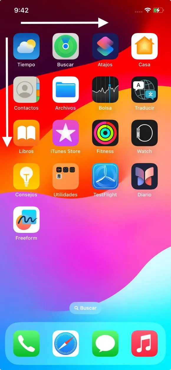
Users relying on accessibility features in applications expect the focus to initiate from the top left corner of the screen and navigate elements horizontally with swipes, moving from left to right. In essence, the focus should span from the upper left corner to the lower right corner of the screen.
 Order focus accessibility apps
It is possible that on certain occasions we may want the order of the focus to change exceptionally for usability needs. In this case we can notify the accessibility frameworks of the new order:
iOS
UIKit
It is possible to change the order of the accessible elements in any view by modifying the property: accessibilityElements available in any element that implements UIView. In the array of elements, the order required by the application must be respected.
@MainActor
Var accessibilityElements: \[Any\]? { get set }
SwiftUI
In this case, it can be done by applying the modifier: accessibilitySortPriority(_:). To any View. It receives a Double as parameter indicating the priority within the View that contains the view to which we want to modify the priority.
func accessibilitySortPriority(\_ sortPriority: Double) -> ModifiedContent<Self, AccessibilityAttachmentModifier\>
Android
XML
There are several ways to change the order of the accessible elements, one of them is to make use of the android:accessibilityTraversalAfter and android:accessibilityTraversalBefore property available in any View.
In android:accessibilityTraversalAfter we tell it the ID of the specific view that should be next in the accessibility order after the current view.
In android:accessibilityTraversalAfter we indicate the ID of the specific view that should be the previous one in the accessibility order before the current view.
Compose
In compose we will use the semantic property transversalIndex to establish the order of accessibility for each view.
Column(
modifier = Modifier.semantics { isTraversalGroup = true },
) {
Text(
text = "First",
modifier = Modifier.semantics { traversalIndex = 0f },
)
Text(
text = "Third",
modifier = Modifier.semantics { traversalIndex = 2f },
)
Text(
text = "Second",
modifier = Modifier.semantics { traversalIndex = 1f },
)
}
Unification of behaviors
While users relying on accessibility features typically stick to one operating system, it's crucial for the focus movement to behave consistently across both platforms. This ensures users don't have to relearn application navigation when switching devices.
Contrast
High contrasts between application components often help visually impaired users. This leads the vast majority of these users to use dark mode within applications that have it implemented.
Message read
When we use text components, the wizard frameworks work quite well since they read the content of the component, as well as in buttons they read the title of the button, and so on.
But there may be times when the message read by the wizard is not exactly what we want. To solve this case:
iOS
UIKit
Overwriting the accessibilityLabel parameter with the appropriate text.
var accessibilityLabel: String? { get set }
SwiftUI
Using the .accessibilityLabel modifier:
func accessibilityLabel<S>(\_ label: S) -> ModifiedContent<Self, AccessibilityAttachmentModifer\> where S: StringProtocol
Android
XML
In the case that we want to provide a specific message that the talkback can read instead of the default content of a component, we can use the android:contentDescription attribute, passing it the corresponding text.
Compose
The contentDescription parameter is used to describe the desired element.
@Composable
func ShareButton(onClick: () -> Unit) {
IconButton(onClick = onClick) {
Icon(
imageVector = Icons.Filled.Share,
contentDescription = stringResource(R.string.label\_share)
)
}
}
Error messages and alerts
For critical error messages and alerts, the accessibility tool should shift focus immediately to notify users with disabilities of what's happening in the application. To signal a sudden focus change:
iOS
UIKit
It is possible by sending a UIAccessibility notification. The type of notification will usually be .screenChanged for when views appear that occupy a new part of the screen or .layoutChanged for when there are major layout changes. The argument expected by this function is the view to which the focus should change.
static func post(
notification: UIAccessibility.Notification,
argument: Any?
)
SwiftUI
It is possible using the property wrapper @AccessiblityFocusState. We will assign this property to a View and when the value changes, the view will get the focus. Documentation and example.
Android
Using the announceForAccessibility method of View we can notify the user of the change.
binding.tvErrorMessage.announceForAccessibility(error)
public void announceForAccessibility(CharSequence text) {
throw new RuntimeException("Stub!");
}
Display times
There are occasions when elements of the application are displayed for a limited time for security reasons. It should be noted that using an application using an accessibility framework is not as snappy, so it is recommended that these display times be increased slightly if accessibility is enabled on the device.
To check if accessibility is enabled:
iOS
Using UIAccessibility's own variable isVoiceOverRunning:
static var isVoiceOverRunning: Bool { get }
Android
Calling isEnabled of the AccessibilityManager class:
public boolean isEnabled()
Hide accessibility
In all applications there are elements that are functional and others that are merely decorative or do not add anything to the functionality of the application. For these cases, it is advisable to hide these elements from the accessibility frameworks so as not to saturate disabled users with irrelevant information. Some examples of this type of elements are: Decorative images, icons without functionality …
To hide these elements:
iOS
UIKit
Using the isAccessiblityElement property.
var isAccessibilityElement: Bool { get set }
SwiftUI
Hiding the element from accessibility with the modifier: accessibilityHidden(Bool)
Android
XML
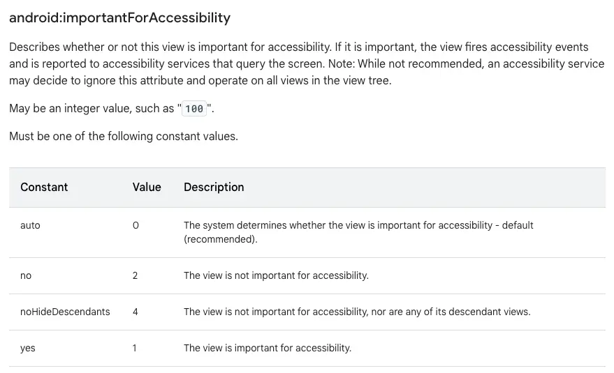
Using the importantForAccessibility property:
 Non-functional elements android xml accessibility apps
Compose
Calling the invisibleToUser method of semantics:
@ExperimentalComposeUiApi
fun SemanticsPropertyReceiver.invisibleToUser(): Unit
Customized components
In all application development we sometimes find that we have to develop custom components that pretend to be a button or other type of element. Although accessibility frameworks give enough clues to the people who use them about the type of element they are targeting, sometimes it is necessary to give a little more information.
iOS
There are numerous classifications that we can give to the different elements displayed on the screen. All these classifications are done through the UIAccessibilityTraits which are constants that specify the type of element that is being focused on. To assign a trait:
UIKit
Using the accessibilityTraits property.
var accessibilityTraits: UIAccessibilityTraits { get set }
SwiftUI
Using the modifier accessiblityAddTraits.
func accessibilityAddTraits(\_ traits: AccessibilityTraits) -> ModifiedContent<Self, AccessibilityAttachmentModifier\>
Android
XML
In Android we use roleDescription. We will find it useful to assign a certain role to custom components.
ViewCompat.setAccessibilityDelegate(binding.lyBaseButtom, object: AccessibilityDelegateCompact() {
override fun onInitializeAccessibilityNodeInfo(host: View, info: AccessibilityNodeInfoCompat) {
super.onInitializeAccessibilityNodeInfo(host, info)
info.roleDescription = "Button"
}
})
Compose
@Composable
fun CustomButton() {
Box(
modifier = Modifier.semantics {
role = Role.Button
}
)
}
Grouping of components
As in the previous section, there are occasions when we must develop custom components that do not exist natively. This can cause a problem with accessibility if we do not correctly inform the framework which components it should group and read as one.
To achieve this:
iOS
UIKit
It is possible by activating accessibility in the container view using the parameter isAccessibilityElement = true. After that, we will have to set what VoiceOver should read when it detects this container using the parameter: accessibilityLabel.
SwiftUI
Using the .accessibilityElement(children: .combine) modifier. It is possible to pass other parameters to this modifier to obtain different behaviors depending on the needs. More information.
Android
XML
It is possible by setting the android:screenReaderFocusable attribute of the container object to true and the android:focusable attribute of each internal object to false. Note that in Android 4.4 (API 19) and earlier, the android:screenReaderFocusable attribute is not available. We should use the android:focusable attribute instead.
<ConstraintLayout
android:id="@+id/song\_data\_container" ...
android:screenReaderFocusable="true"\>

<TextView
android:id="@+id/song\_title"...
android:focusable="false"
android:text="@string/my\_song\_title" />

<TextView
android:id="@+id/song\_artist"
android\_focusable="false"
android:text="@string/my\_songwriter" />
</ConstraintLayout\>
Compose
Using the mergeDescendants parameter in the semantics modifier. This way the accessibility services will select only the combined element.
Row(modifier = Modifier.semantics(mergeDescendants = true) {}) {
Image(
imageVector = Icons.Filled.AccountCircle,
contentDescription = null // decorative
)
Column {
Text(metadata.author.name)
Text("${metadata.date} \* ${metadata.readTimeMinutes} min read")
}
}
Conclusions
By prioritizing accessibility from the early stages of development and utilizing tools like VoiceOver on iOS and TalkBack on Android, we ensure that our application is usable by a wide audience, including those with visual impairments.
By adhering to these principles, we're not only promoting equity and digital inclusion but also significantly expanding our potential user base.
As current practices demonstrate, companies increasingly adapt their services and products to cater to diverse users, thus complying with various regulations and laws, such as the New Law on Customer Service.
Bibliographic references
NSObject | UIAccessibility. (s. f.). Apple Developer Documentation
https://developer.apple.com/documentation/objectivec/nsobject/uiaccessibility
SwiftUI | Accessible Navigation. (s. f.). Apple Developer Documentation
https://developer.apple.com/documentation/swiftui/accessible-navigation
SwiftUI | Accessibility fundamentals. (s. f.). Apple Developer Documentation
https://developer.apple.com/documentation/swiftui/accessibility-fundamentals
Build accessible apps. (s. f.). Android Developers
https://developer.android.com/guide/topics/ui/accessibility
Semantics in Compose. (s. f.). Android Developers
https://developer.android.com/develop/ui/compose/semantics
Accessibility in Compose. (s. f.). Android Developers
https://developer.android.com/develop/ui/compose/accessibility
Demografía de la Baja Visión y de la Ceguera en España. (2015, 27 agosto). Universidad de
Valladolid
https://uvadoc.uva.es/bitstream/handle/10324/14293/TFM-M259.pdf;jsessionid=51E41EC4BE
9F5B0BEFFA068AB83F480?sequence=1
Informe agregado del seguimiento en profundidad de aplicaciones para dispositivos móviles
(2021). Observatorio de Accesibilidad.
https://administracionelectronica.gob.es/PAe/accesibilidad/2021ProfundidadAPPS
Our latest news
Interested in learning more about how we are constantly adapting to the new digital frontier?

Tech Insight
December 19, 2024
Contract Testing with Pact - The final cheetsheet

Insight
December 18, 2024
Agility, Complexity and Empirical Method

Tech Insight
December 17, 2024
Google’s new quantum processor is here, but what does it really mean?

Insight
December 10, 2024
Groundbreaking technologies today that will reshape the innovation landscape in 2025

